The MedCo logo is used across various applications, from business stationery and publications to signage and digital applications. To create visual consistency across all applications, use the preferred size logo for the type of execution.
Anatomy
The logo includes the MedCo icon mark and a logotype. Both are important and should always appear together. The relationship between these elements has been established, and these proportions are fixed as illustrated. They must never be altered or modified in any way.
Size
Whenever possible, the logo should be used at a size between 1.75” and 2.25” on printed materials. The logo is measured from the left edge of the icon to the right edge of the slogan
Clear space
The preferred clear space is equal to “X,” as illustrated on this page. “X” is equal to the height of the space between the dots in the icon.
![]()
Variation (colors and lock ups)
Two different reproduction versions of the MedCo logo are available: full-color (preferred) and one-color (e.g., solid black, gray, or white).
One-color solid logos
The one-color solid black or white (sometimes called reversed) logos are intended for use when reproduction methods prohibit the use of the full-color logo. However, if the logo appears in a busy environment, such as over an image, a one-color logo may be ideal.

Backgrounds
The full-color logo should be used only on a white background to ensure maximum contrast. If the logo is used on a solid color background, the one-color version of the logo should be used. Whenever the logo is used as an image, the one-color logo should also be used. Note that special attention needs to be put toward sufficient contrast.


Proportions
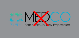
The integrity of the logo must be kept at all times. Altering the logo by ways of stretching compressing, or shearing is not accepted.


Co-branding
Whenever MedCo is used as a primary brand in a co-branding situation, the secondary brand logo should be 25% smaller than MedCo’s logo.